How to Compress Images for the Web: JPEG vs WebP vs AVIF
Images are usually the heaviest part of a web page, and the largest image above the fold is often the element that decides your Largest Contentful Paint. The good news: most image weight is waste, and removing it takes minutes once you have a routine.
This guide gives you that routine: resize, choose a format, compress, serve with fallbacks, and load at the right time. It also explains when to pick JPEG, PNG, WebP, AVIF or SVG.
Quick answer: resize each image to the largest size it's actually displayed at, use AVIF or WebP for photos (with a JPEG fallback via
<picture>), SVG for icons and logos, compress until you can just see a difference and then back off a step, setwidthandheight, and lazy-load only images below the fold.
In this guide
- Why image weight matters
- Lossy vs lossless
- JPEG vs PNG vs WebP vs AVIF vs SVG
- The five-step workflow
- Choosing quality settings
- Common mistakes
- FAQ
Why image weight matters
Largest Contentful Paint measures when the biggest image or text block in the viewport finishes rendering. Google's "good" threshold is 2.5 seconds or less for 75% of visits (web.dev). When the LCP element is an image, which is common on landing pages and articles, its file size and how early it starts downloading directly affect that number. LCP is also 25% of the Lighthouse performance score (how the score is calculated).
Heavy images also cost your visitors data, which matters on metered mobile plans.
Lossy vs lossless compression
- Lossless compression rewrites the file more efficiently without changing a single pixel. Safe for everything, but savings are modest.
- Lossy compression discards detail the eye is unlikely to notice. Savings are much larger; push it too far and you get blocky artefacts, banding in gradients and smeared edges.
Photos tolerate lossy compression well. Screenshots, text, line art and logos usually don't: use lossless formats or SVG for those.
JPEG vs PNG vs WebP vs AVIF vs SVG
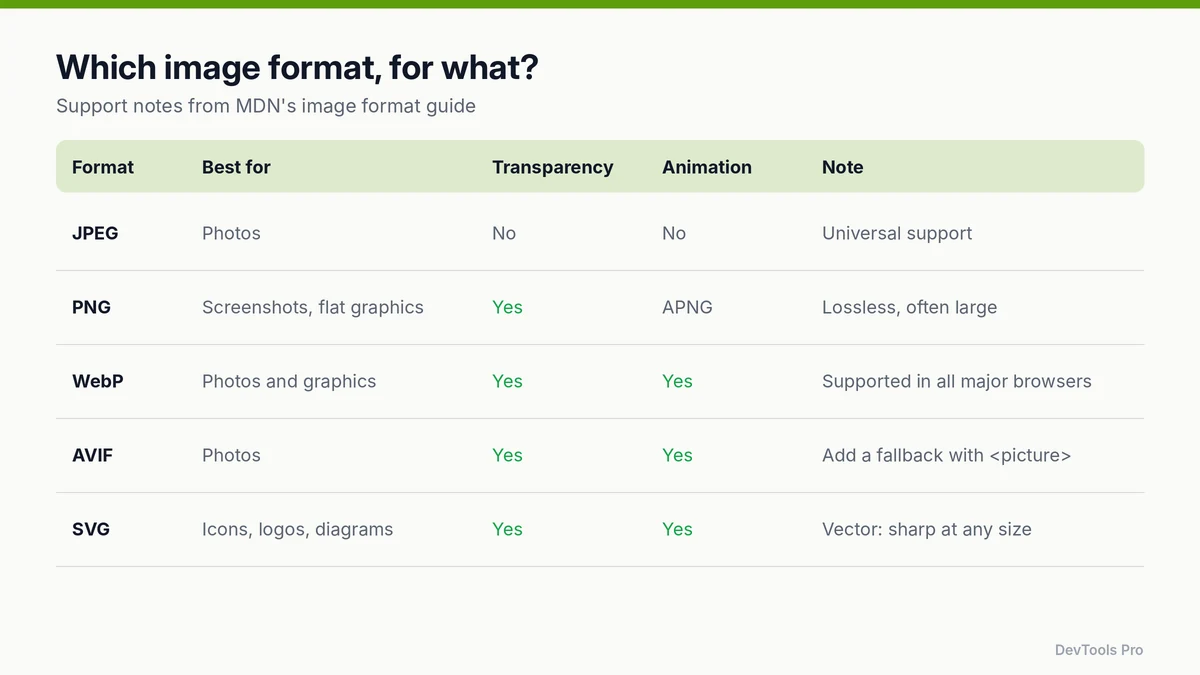
| Format | Best for | Transparency | Animation | Notes |
|---|---|---|---|---|
| JPEG | Photos | No | No | Universal support; the safe fallback |
| PNG | Screenshots, flat graphics needing exact pixels | Yes | APNG | Lossless; often large for photos |
| WebP | Photos and graphics | Yes | Yes | Lossy and lossless modes; supported in all major browsers |
| AVIF | Photos | Yes | Yes | Strong compression; serve with a fallback |
| SVG | Icons, logos, diagrams | Yes | Yes | Vector, sharp at any size; usually tiny |
MDN's image format guide is the reference for these details. A few points from it worth knowing:
- WebP files are typically 25–35% smaller than JPEGs at similar compression levels, and MDN rates it an excellent choice for both still and animated images.
- AVIF generally compresses better still, but MDN recommends including fallbacks to better-supported formats using the
<picture>element. - AVIF doesn't support progressive rendering, so the file must fully download before it displays.
Rule of thumb: AVIF first, WebP second, JPEG as the fallback for photos; SVG for anything drawn; PNG only when you need lossless pixels and WebP lossless isn't an option.
How to compress images for the web: five steps
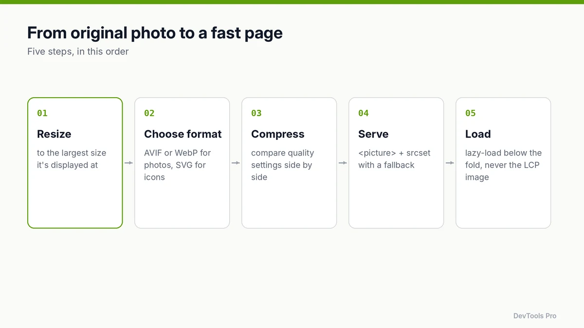
1. Resize to the displayed size
A 4000-pixel-wide camera photo shown in an 800-pixel column wastes most of its pixels. Find the largest width the image is shown at (DevTools' Elements panel shows rendered size), double it for high-density screens if needed, and resize. The image resizer does this in the browser.
2. Choose the format
Use the table above. Convert to WebP or AVIF, and keep a JPEG copy as the fallback.
3. Compress
Run each image through an online image compressor and compare quality settings side by side (see the next section). For SVGs, the SVG optimiser strips editor metadata and redundant markup.
4. Serve with <picture> and srcset
Let the browser pick the best format it supports and the right size for the screen:
html<picture>
  <source type="image/avif" srcset="hero-800.avif 800w, hero-1600.avif 1600w" sizes="(max-width: 840px) 100vw, 800px">
  <source type="image/webp" srcset="hero-800.webp 800w, hero-1600.webp 1600w" sizes="(max-width: 840px) 100vw, 800px">
  <img src="hero-800.jpg"
       srcset="hero-800.jpg 800w, hero-1600.jpg 1600w"
       sizes="(max-width: 840px) 100vw, 800px"
       width="800" height="450"
       alt="Developer reviewing a performance report on a laptop"
       fetchpriority="high">
</picture>
typelets browsers skip formats they can't decode.widthandheightlet the browser reserve space before the image loads, preventing layout shift.altdescribes the image for screen readers and search engines (Google image SEO guidance).
5. Load at the right time
- Below the fold: add
loading="lazy"so the browser defers the download until the image is near the viewport (MDN —<img>). - The LCP image: never lazy-load it. Consider
fetchpriority="high"so it starts downloading early.
Choosing quality settings without guessing
There's no universal "quality 80" answer: the right setting depends on the image, the format and the encoder. A reliable method:
- Export the same image at three or four quality levels.
- View each at actual size on a normal screen, then zoom to 200% on areas with fine detail, gradients (skies, shadows) and text.
- Pick the lowest setting where you can't see a difference at actual size, then go one step higher for safety.
- Reuse that setting for similar images (all product photos, all blog heroes) and spot-check new batches.
If you publish before-and-after numbers, use files you measured yourself and note the tool and settings. Results vary widely between images.
Common mistakes
- Lazy-loading the hero image. It delays LCP. Lazy-load only below-the-fold images.
- Missing
widthandheight. Content jumps when images arrive, which hurts CLS. - Serving one huge file to every screen. Use
srcsetandsizes. - Using PNG for photos. Files are far larger than WebP or JPEG for the same photo.
- Recompressing already compressed JPEGs repeatedly. Each lossy pass adds artefacts; start from the original.
- Inlining large images as Base64. It inflates size by roughly a third and stops the browser caching the image separately. Reserve the Base64 image converter for tiny icons.
- No fallback for AVIF. Older browsers then show nothing.
Frequently asked questions
What is the best image format for websites?
For photos, AVIF or WebP with a JPEG fallback. For icons, logos and diagrams, SVG. Use PNG only when you need lossless pixels and can't use WebP lossless.
Does compressing images reduce quality?
Lossy compression does remove detail, but at sensible settings the difference is invisible at normal viewing size. Lossless compression doesn't change the image at all.
WebP or AVIF: which should I use?
AVIF usually produces smaller files for photos; WebP has long-standing support and supports progressive display. Serving both through <picture>, AVIF first, gets the benefits of each.
What size should web images be?
As wide as the largest space they're displayed in, times the device pixel ratio you want to support (often 2×), and no larger. Use srcset to offer smaller versions to smaller screens.
Should I inline images as Base64?
Only very small images, such as a few-hundred-byte icon. Base64 makes files larger and prevents separate caching, so it slows down anything bigger.
Conclusion
Compressing images for the web is a routine, not a one-off: resize, pick the format, compress until just before quality drops, serve with <picture> and srcset, and lazy-load only what's below the fold. Do that for every new image and LCP problems caused by images largely disappear.
Compress and convert your images in the browser with the image compressor →
Related tools
Image compressor · Image resizer · Image converter · SVG optimiser
Related articles
- How the Lighthouse performance score is calculated
- Website launch checklist: 12 checks with free web developer tools
Sources
- MDN — Image file type and format guide: format features, support and fallback advice.
- web.dev — Web Vitals: LCP threshold.
- Google Search Central — Google Images SEO best practices: alt text and file guidance.
- MDN —
<img>: The Image Embed element:loading,srcset,sizes,widthandheight.
Related Posts
How to Create an HTML Table: Code, CSS and Accessibility
Build an HTML table from scratch: the right tags, merged cells, responsive CSS and accessible headers, plus how to turn spreadsheet data into HTML.
Read More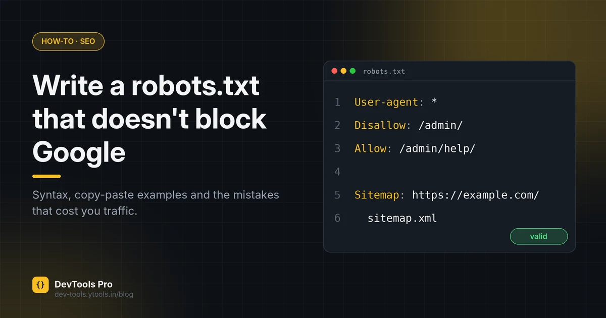
How to Create a robots.txt File: Rules, Examples, Mistakes
Create a correct robots.txt in minutes: syntax, copy-paste examples for common setups, how to test it, and the mistakes that accidentally block Google.
Read More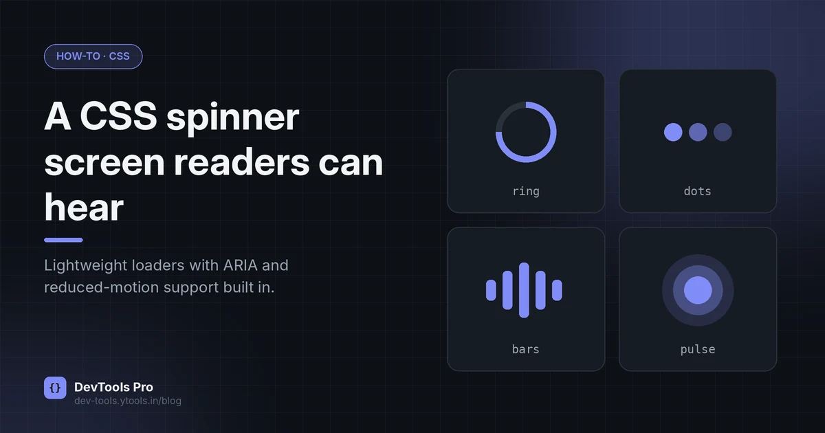
How to Make a CSS-Only Loading Spinner (Accessible Code)
Build a CSS-only loading spinner with @keyframes, make it accessible with ARIA and reduced-motion support, and learn when a skeleton screen is better.
Read More