How to Make a CSS-Only Loading Spinner (Accessible Code)
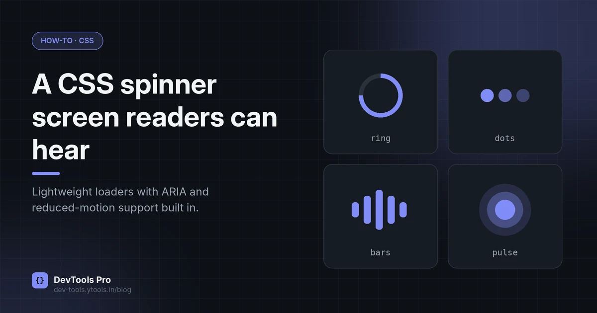
A loading spinner is usually the first animation a developer writes, and one of the most often broken. It spins for sighted users but says nothing to screen readers, ignores people who've asked their device to reduce motion, and flashes for a split second on fast connections.
This guide builds a CSS loading spinner in ten lines, then fixes all three problems. You'll get four copy-paste variants, a pattern for accessible announcements, and a decision table for when a spinner is the wrong choice.
Quick answer: draw a circle with a coloured top border, rotate it forever with
@keyframesandtransform: rotate(), hide the visual from assistive tech witharia-hidden="true", announce "Loading…" in arole="status"element, and slow or stop the animation underprefers-reduced-motion: reduce.
In this guide
- The 10-line spinner
- How it works
- Four variants
- Size and colour with custom properties
- Accessibility
- Spinner, skeleton or progress bar?
- Avoid the flash
- FAQ
The 10-line CSS spinner
html<span class="spinner" aria-hidden="true"></span>
css.spinner {
  width: 40px;
  height: 40px;
  border: 4px solid #e5e7eb;        /* the track */
  border-top-color: #4f46e5;        /* the moving arc */
  border-radius: 50%;
  animation: spin 0.8s linear infinite;
}
@keyframes spin {
  to { transform: rotate(360deg); }
}
That's a working spinner with no JavaScript and no images. Prefer to design one visually? The loading spinner generator lets you pick a style, size, speed and colour, then copy the CSS.
How the CSS works
textSquare element  →  border-radius: 50%  →  one border coloured  →  rotate 0→360°, forever
   (40×40)           (a circle)             (an arc on a track)      (@keyframes + animation)
@keyframes spindefines the animation's waypoints. With onlyto, the browser animates from the element's current state (0°) to 360°. MDN's@keyframesreference covers the syntax.animation: spin 0.8s linear infiniteapplies it: name, duration, timing function, repeat count.linearkeeps the speed constant; easing makes the ring appear to stutter.transform: rotate()is the property doing the work. Animatingtransformandopacityis generally cheaper for the browser than animatingwidth,height,topormargin, which force layout to be recalculated every frame.
Four spinner variants to copy
All four use the same custom properties (next section) so they're easy to theme.
Ring
The example above. Clear and compact; the best default.
Dots
html<span class="dots" aria-hidden="true"><span></span><span></span><span></span></span>
css.dots { display: inline-flex; gap: 6px; }
.dots span {
  width: 10px; height: 10px; border-radius: 50%;
  background: var(--spinner-color, #4f46e5);
  animation: fade 1s ease-in-out infinite;
}
.dots span:nth-child(2) { animation-delay: 0.15s; }
.dots span:nth-child(3) { animation-delay: 0.3s; }
@keyframes fade { 0%, 100% { opacity: 0.25; } 50% { opacity: 1; } }
Bars
css.bars { display: inline-flex; gap: 4px; align-items: center; height: 32px; }
.bars span {
  width: 5px; height: 100%; border-radius: 3px;
  background: var(--spinner-color, #4f46e5);
  animation: stretch 1s ease-in-out infinite;
}
.bars span:nth-child(2) { animation-delay: 0.1s; }
.bars span:nth-child(3) { animation-delay: 0.2s; }
.bars span:nth-child(4) { animation-delay: 0.3s; }
@keyframes stretch { 0%, 100% { transform: scaleY(0.4); } 50% { transform: scaleY(1); } }
Note scaleY rather than animating height.
Pulse
css.pulse {
  width: 32px; height: 32px; border-radius: 50%;
  background: var(--spinner-color, #4f46e5);
  animation: pulse 1.2s ease-out infinite;
}
@keyframes pulse {
  0%   { transform: scale(0.6); opacity: 1; }
  100% { transform: scale(1.4); opacity: 0; }
}
For your own keyframe sequences, the CSS animation generator previews timing and easing before you copy the code.
Size and colour with CSS custom properties
css.spinner {
  --size: 40px;
  --thickness: 4px;
  --spinner-color: #4f46e5;
  --track-color: #e5e7eb;

  width: var(--size);
  height: var(--size);
  border: var(--thickness) solid var(--track-color);
  border-top-color: var(--spinner-color);
  border-radius: 50%;
  animation: spin 0.8s linear infinite;
}
.spinner.small { --size: 16px; --thickness: 2px; }
.btn-primary .spinner { --spinner-color: currentColor; --track-color: transparent; }
Using currentColor inside buttons makes the spinner match the button text automatically. Need a palette that works in light and dark themes? Try the colour palette generator.
Making the spinner accessible
A spinning shape communicates nothing to someone using a screen reader, and constant motion can make some people feel unwell. Four layers fix that.
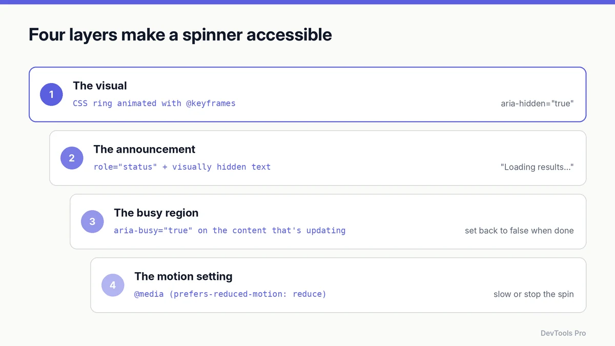
1. Hide the decoration
The animated element is decoration, so hide it from assistive technology with aria-hidden="true".
2. Announce the state
Put the message in an element with role="status", a polite live region defined in WAI-ARIA. Keep the text visually hidden if you don't want it on screen:
html<div role="status">
  <span class="spinner" aria-hidden="true"></span>
  <span class="visually-hidden">Loading results…</span>
</div>
css.visually-hidden {
  position: absolute; width: 1px; height: 1px;
  padding: 0; margin: -1px; overflow: hidden;
  clip: rect(0 0 0 0); white-space: nowrap; border: 0;
}
When loading finishes, replace the text ("12 results loaded") or remove the status element.
3. Mark the region as busy
Set aria-busy="true" on the content that's being updated, and back to false when it's done. MDN describes this as telling assistive technologies that changes are in progress so they can wait before announcing them (MDN — aria-busy).
html<section id="results" aria-busy="true">…</section>
jsresults.setAttribute('aria-busy', 'false');
4. Respect reduced motion
People can ask their operating system to minimise non-essential motion; CSS exposes that through the prefers-reduced-motion media feature (MDN).
css@media (prefers-reduced-motion: reduce) {
  .spinner { animation-duration: 2.4s; }        /* slower */
  .dots span, .bars span, .pulse { animation: none; opacity: 0.6; } /* static */
}
Slowing a ring is usually fine; for the busier variants, a static indicator plus the text is kinder.
Spinner, skeleton or progress bar?
A spinner says "something is happening, I don't know for how long". If you know more than that, use a better pattern.
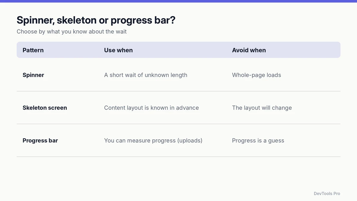
| Pattern | Use when | Avoid when |
|---|---|---|
| Spinner | A short wait of unknown length (a button action, a small panel) | Loading a whole page |
| Skeleton screen | You know the layout of what's coming (cards, lists, profile) | The final layout differs, which causes a jump |
| Progress bar | You can measure progress (uploads, multi-step jobs) | Progress would be a guess |
Whichever you choose, reserve the space the final content will occupy. Content that pushes the page down when it arrives counts as layout shift, which is one of the Lighthouse performance metrics (how the score is calculated).
Avoid the flash on fast loads
On a fast connection, a spinner that appears for 80 ms and vanishes looks like a glitch. Delay it:
css.spinner-delayed {
  opacity: 0;
  animation: spin 0.8s linear infinite, appear 0s linear 0.3s forwards;
}
@keyframes appear { to { opacity: 1; } }
The spinner rotates from the start but only becomes visible after 300 ms. If the content arrives sooner, the user never sees it. Keep the role="status" text update immediate so screen-reader users still get feedback.
Common mistakes
- No text alternative. A spinner alone is silent to screen readers.
- Animating
width,heightormargininstead oftransform, which costs more work every frame. - Ignoring
prefers-reduced-motion. - Full-page spinners for content you could stream in. Show what's ready and load the rest.
- Forgetting to remove it. Clear the spinner and reset
aria-busyon errors as well as success. - Shipping unminified CSS for a component used on every page; the code minifier trims it.
Frequently asked questions
How do I make a loading spinner in HTML and CSS?
Create a square element, round it with border-radius: 50%, give it a light border with one coloured side, and rotate it continuously with a @keyframes animation on transform: rotate().
How do I centre a spinner?
Place it in a flex or grid container: display: grid; place-items: center; centres it both ways.
Should I use a spinner or a skeleton screen?
Use a skeleton when you know the layout of the incoming content, a spinner for short waits of unknown length, and a progress bar when progress can be measured.
How do I stop a spinner flashing on fast loads?
Delay its appearance by around 300 ms with an opacity animation that has an animation-delay. If loading finishes first, it never shows.
Can a loading spinner hurt Core Web Vitals?
The spinner itself is light, but what happens around it matters: if loaded content pushes the page around when it replaces the spinner, that's layout shift. Reserve the final content's space in advance.
Conclusion
A good CSS loading spinner takes ten lines; an accessible one takes about twenty. Hide the decoration, announce the state, mark the busy region, respect reduced motion, and only show a spinner when nothing more informative is available.
Customise and export a spinner with the loading spinner generator →
Related tools
Loading spinner generator · CSS animation generator · Colour palette generator · Code minifier
Related articles
- How the Lighthouse performance score is calculated
- Developer utilities: which free tools you need for each task
Sources
- MDN — @keyframes: keyframe syntax.
- MDN — prefers-reduced-motion: detecting the reduced-motion setting.
- MDN — aria-busy: marking a region as updating.
- W3C — WAI-ARIA 1.2: status role: polite live region semantics.
Related Posts
How to Compress Images for the Web: JPEG vs WebP vs AVIF
Choose the right image format, compress without visible quality loss, and serve WebP and AVIF safely with fallbacks. Includes a format decision table.
Read More
How to Create an HTML Table: Code, CSS and Accessibility
Build an HTML table from scratch: the right tags, merged cells, responsive CSS and accessible headers, plus how to turn spreadsheet data into HTML.
Read More
How to Create a robots.txt File: Rules, Examples, Mistakes
Create a correct robots.txt in minutes: syntax, copy-paste examples for common setups, how to test it, and the mistakes that accidentally block Google.
Read More